
Portfolio:
Personal Logo
I thought that the best way to start this journey is to present you my personal logo and meanings behind it.
This logotype was created really spontaneously, when I was just playing around with letters in my sketchbook.
At first, I was just connecting some cursive latin letters, after I started to flip them around and I saw a weird cartoonish face. I gave it an eye and a nose.
When I looked closely I saw that these additional parts made it look like a cyrillic letters of my name.
«Such a bingo!💥» - I thought.

Pattern work of the logotype
I was just going fully 360° on it. 🌐
I can see a dog, a trolley, an octopus or a monster in it.
Maybe you can see something more? 👀


“ Typo Hoop “ - is the name of the font, which I’m using here. In my opinion, it compliments the logotype with the playfulness and roundness of the letters in it.

I picked orange colour as main colour, because it is considered the color of creativity as it encourages innovation and enthusiasm.
My favourite sketchbook is also exact same orange colour. So it’s a match - match situation. 🍊
Here you can see the usage of colour palette, font and some geometry behind the logo.
" Åñgār "
One day me and my friend decided to make our own electronic music event. Before we started, there was almost nothing. We had only a place, where to organize it and a vision of how it should be.
My task was to capture this vision and make it clear for our audience. If you have a look closely to the posters, you can see the there are some similarities. It’s like a DNA, which instantly allows you to recognize the brand. 🧬
«Åñgār» is the biggest design project I have ever made I’m really proud of it and appreciate everyone, who participated in it with us. 🖤


Åñgār x Kauplus Aasia
The main idea was to make a poster, which will showcase that Åñgår brings rave to this location.
“ Kauplus Aasia “ translates as “ Asian Shop “.
I believe that these posters talks for themselves.

I like to work with interesting fonts and graphics.
Also get a lot of my inspiration from street art culture.
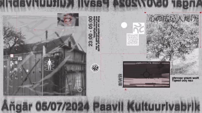
The idea was to create a poster, which is easy to customize for future events. I took some photos of the location and customized them in our iconic way. The more you look at it, the more you can find details, which represent our DNA.

Projects for clients
Here are some examples of my work for clients. I have experience with big companies, startups, sports media, artists and events.
For a wider look please go to " Projects " tab :)


Blank
Visual identity for Video Production company.
Client wanted to have a logotype, which would be not straight away recognizable only with videography,
but something what would be simple, minimalistic and represent street culture.


FC Sparta Maardu
This is a football club for youth talents, so I made a coat of arms , which will make them proud of playing and fight for.
Greek - looking shapes, font, bold colors and straight - forward information in social media.
This is my interpretation of a Spartan warrior.

kkk.png)


4SE
Four Side Element is a construction company, which is operating in Estonia, Baltics and Scandinavia.
4SE is a shortcut. Those letters are used for the logotype. The cube shape and color palette represents various reinforced concrete panels, which are the main specification of this company.


